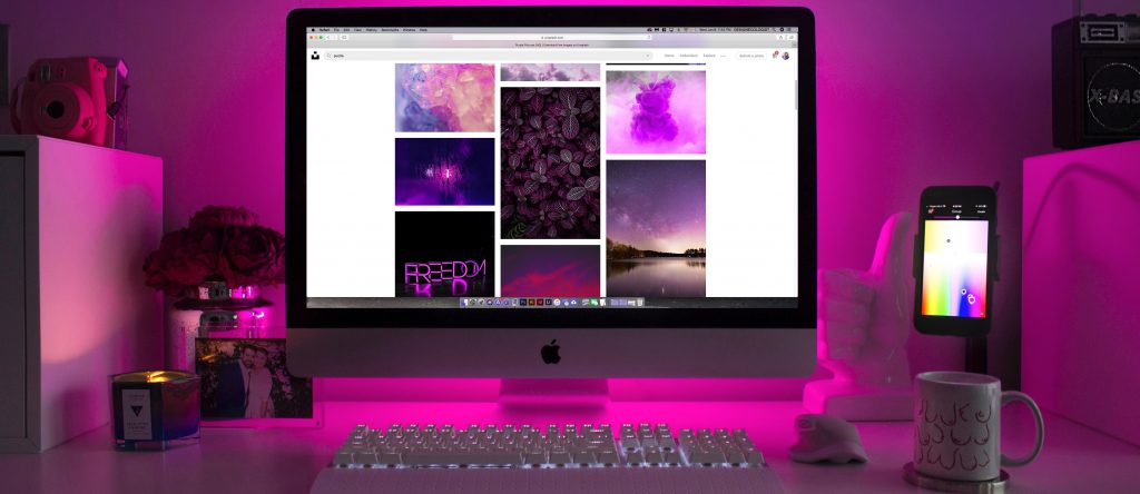
I’ve said it before and I’ll say it again – colors play a huge role in how we feel and how prepared we are to take in new information and what to do with it. While there are many differences between cultures and how they perceive colors, there are a few traits that are akin to the western world, so I’ll be focusing on them. Here are a few common effects of color on the human psyche.
Red
Red is one of the most often used colors in marketing. This is because it represents excitement, whether a romantic one or something more along the lines of adrenaline-pumped action. Red tells you something exciting and dramatic is about to happen and you can be a part of it. In China, red is the color of money and wealth.

Blue
Another color heavily used in western media is blue. It projects strength and stability and a promise that everything will turn out okay. Blue wakes you up and fills you with energy. It’s often used with red as the dominant color. Consider talk-shows and news segments. Those that want you to be confident, but still at the edge of your seat, employ both colors.
Yellow
Yellow typically refers to optimism and perkiness. If you want your message to project clarity and warmth on your consumers, yellow is the color to choose. The sun is yellow and it is associated with fine weather and, consequently, the good mood that inevitably follows. Ads that feature beach parties, holidays, and other scenes that want to awake positive emotions often use yellow. McDonald’s, Capri Sun, and National Geographic have yellow in their logos specifically with this in mind.

Green
Green is associated with nature and health. Many pharmacies, medication, supplements, and stores like Whole Foods utilize this association to their advantage. Green is the color of grass and trees, so it must be about growth, right?
Purple
Creative and alternative, purple appeals to royalty. After all, purple is a royal color because of its price in the past, when it was impossible for anyone else to afford it. This notion can backfire somewhat, however. Consider products and images in bad taste that rely heavily on purple because they believe it will project wealth.

Know Your Audience
As I’ve mentioned in my introduction. For example, in western countries, pink is seen as a girly color, something for the female population aged 10 and below. In Japan, however, pink is the color of crass humor and health.
Choosing the colors for your audience is extremely important when creating a brand or a marketing campaign. Cultural differences made for some very interesting misunderstandings in the past, especially with images and translations. So, when creating a new logo for your firm or that of your client, choose the colors very carefully. It could make or break you.


