Math and art sometimes create a beautiful harmony. Some of the finest artists of old have used science and math in their creations in an effort to understand nature better or express their admiration for it. One of the principles often found in art is the famous Golden Ratio. We don’t have to be revolutionary artists to make good use of the principle, we just have to be designers.
What Is the Golden Ratio?
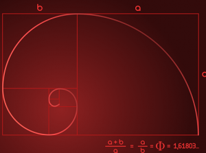
The Golden Ratio has many different names, but this is one that is most commonly used. It is derived from the Fibonacci Sequence where each number is the sum of the two numbers before it. It goes: 0,1,1,2,3,5,8,13,21,34, and so on. The ratio between any two numbers next to each other comes out to approximately 1:1.618. It is a beautiful sequence that can be found in nature, sort of. The real ratio is an irrational number.

How to Use It in Design?
Consider the Golden Spiral for your page layout. Remember how size and spacing are important in creating visual hierarchy? You can use this to your advantage by choosing which elements go where in order of importance by using the spaces designated by the Golden Spiral.

Nowhere does it state that you have to use the complete spiral. If your layout is simply two sections of a page, you can choose to make these sections match the ratio. You can use it to control the balance of your compositions, as well.
There are several design tools that are aimed strictly at applying the Golden Ratio to your designs. There is the GRT Calculator that deals with font sizes if you are looking for an upgrade for your typography. If you are listing lines of text, simply choose a font, its size, and the content width and it will give you the next line in the sequence.
This is just one of the numerous tools out there for specific tasks.
The Rule of Thirds
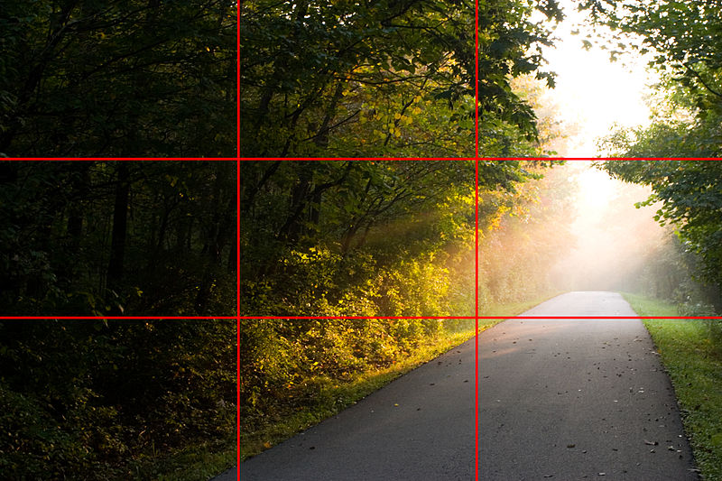
The Rule of Thirds is a famous method of composition in photography. It deals with where the viewer is likely to focus their attention and to plan accordingly. Normally, you would divide the photo into nine equally-sized blocks, but if you employ the Golden Ratio, you can draw two lines and two columns and aim for the relationship between them to correspond to the ratio.

Should You Use It?
That is up to you. Some people swear by it, others dismiss it entirely as impractical, due to the fact that the ratio is merely nearly 1:1.618, when, in reality, it’s 1.6180339… The math involved makes it too irksome for some to deal with it, particularly if they are perfectionists. It is simply just another tool or method in the game of graphic design. The fact is that some of the biggest brands used it a couple of times for their campaigns and logos, like Twitter, so it’s not bad – it just comes down to preference.


