Balance is one of the most basic principles of graphic design, if not the most basic. Without balance, your layout may not be as readable as you would have hoped and your message might not have the desired impact. Here are a few tricks to achieve balance.
Symmetry
The most common way to keep your elements balanced is symmetry. You can do so by evenly spreading your elements vertically, horizontally, or radially. Horizontal elements are there to provide information, vertical to compare and contrast, and radial elements are mostly about priority. It is the most common form of balance and therefore sometimes fails to catch the user’s attention because it is too regular. Think about it – if everyone is using it, why should you stand out?

Asymmetry
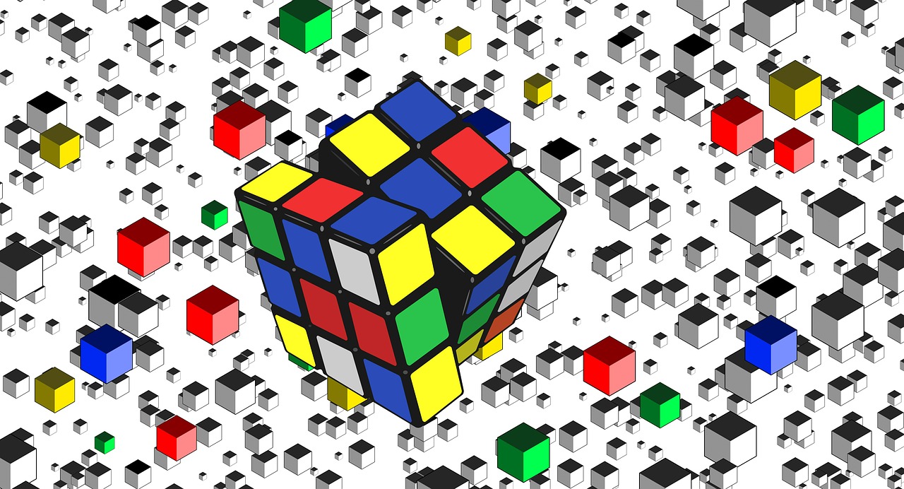
Equally important and more utilized in some cases, asymmetrical balance is sometimes difficult to achieve. Its appeal lies in its, shall we say, irregularity. To achieve it, you must use your elements wisely. An object that is similar but different from others should have its share of designated space to complement the others. This can be done with fiving the object a different color, increasing its size, or giving it more contrast, for example. Asymmetry sometimes combines complex elements with minimalism.
Now that we have the basics of the layout out of the way, here are other ways of achieving balance.
Color and Contrast
If the layout follows one color scheme, it is natural to utilize similar colors. If you are trying to present the difference between the elements or make some of them more visible, using opposite colors for the sake of contrast is the way to go.

Priority and Size
Are all elements equally important? I find that hard to believe. If you want your viewers to focus on something, place them where they will be seen and modify their size accordingly. If there are several elements of equal importance that take priority over the rest of the content, spread them out. What I mean by this is give them places where they will get an equal amount of focus.
Off-Balance
The reason we are trying to achieve balance is to make the end product more appealing. People love compositions where there is a place for everything and everything is in its place. That being said, there is some merit to using a design that doesn’t have balance. If your goal is to make the viewer feel uneasy or slightly uncomfortable, making a composition without balance is the way to go. Consider movie posters for horrors and thrillers to give you an idea of what I’m talking about. They are red, unsettling, and the elements, colors, and contrast are slightly off in order to tell you what emotions you can expect from the movie.


